I'll admit, it's no masterpiece, but it isn't that bad... :)Agozer wrote:That just looks fugly.
Well, I still think the 5x7 looks nice for the time being, at least.
Moderator: ZSNES Mods
I'll admit, it's no masterpiece, but it isn't that bad... :)Agozer wrote:That just looks fugly.
Yes, it looks very nice. I wanted to make my fonts similar to those, but 5x5 only let's you do so much. :/byuu wrote:Well, I still think the 5x7 looks nice for the time being, at least.
Yes, it's clear enough. Hopefully it will be clear for enough for the average end-user, too. ;)Deathlike2 wrote:xamenus, I've post to the docs forum about the format, hopefully it is clear enough for you.
Being on of the people that chose to play the lowercase version of the Tales of Phantasia translation, I'd definitely use it.byuu wrote:Ah, yes. 5x7 would work great.
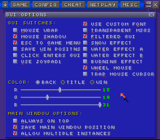
( http://img468.imageshack.us/my.php?imag ... ull1wp.png )
And please, don't say "that's impossible". I was told the same thing about adding a VWF to the GUI and that was far more difficult
The only thing is that the load menu would have to go from 15 items to 13. I believe it is well worth it for being able to enter caps+lowercase letters and have an overall much more readable font. The problem with the load screen has always been the horizontal width, anyway. But I'm sure you guys have your reasons for not merging the filename and directory fields and/or using a variable-width font for that window alone.
Those horizontal red lines would obviously need to go under letters other than 'g,j,p,q,y' ortherwise the red will be slightly obscured. That, or one could "mask" against the letters (eg combine the red+bottom line of these letters).
Anyway, if you guys like this, and want to use it, but won't do the work... then if you promise me you will use it, I can try and work on modifying ZSNES to support this 5x7 font system.
Ooh. With a 10x10 font, one could potentially use the Chrono Trigger font.grinvader wrote:Or you could wait for me to find the time to actually pull the GUI upsize and make a semi-VW font (semi because it would max horizontally at 10 for limited width reasons).byuu wrote:Ah, yes. 5x7 would work great.
And please, don't say "that's impossible". I was told the same thing about adding a VWF to the GUI and that was far more difficult
<stuff>
Anyway, if you guys like this, and want to use it, but won't do the work... then if you promise me you will use it, I can try and work on modifying ZSNES to support this 5x7 font system.
Of course, finding the time could be tough. Heh.
